The intention behind this design is to demonstrate Champion’s technical skill and the contribution it can make to architectural projects, also on a large scale.

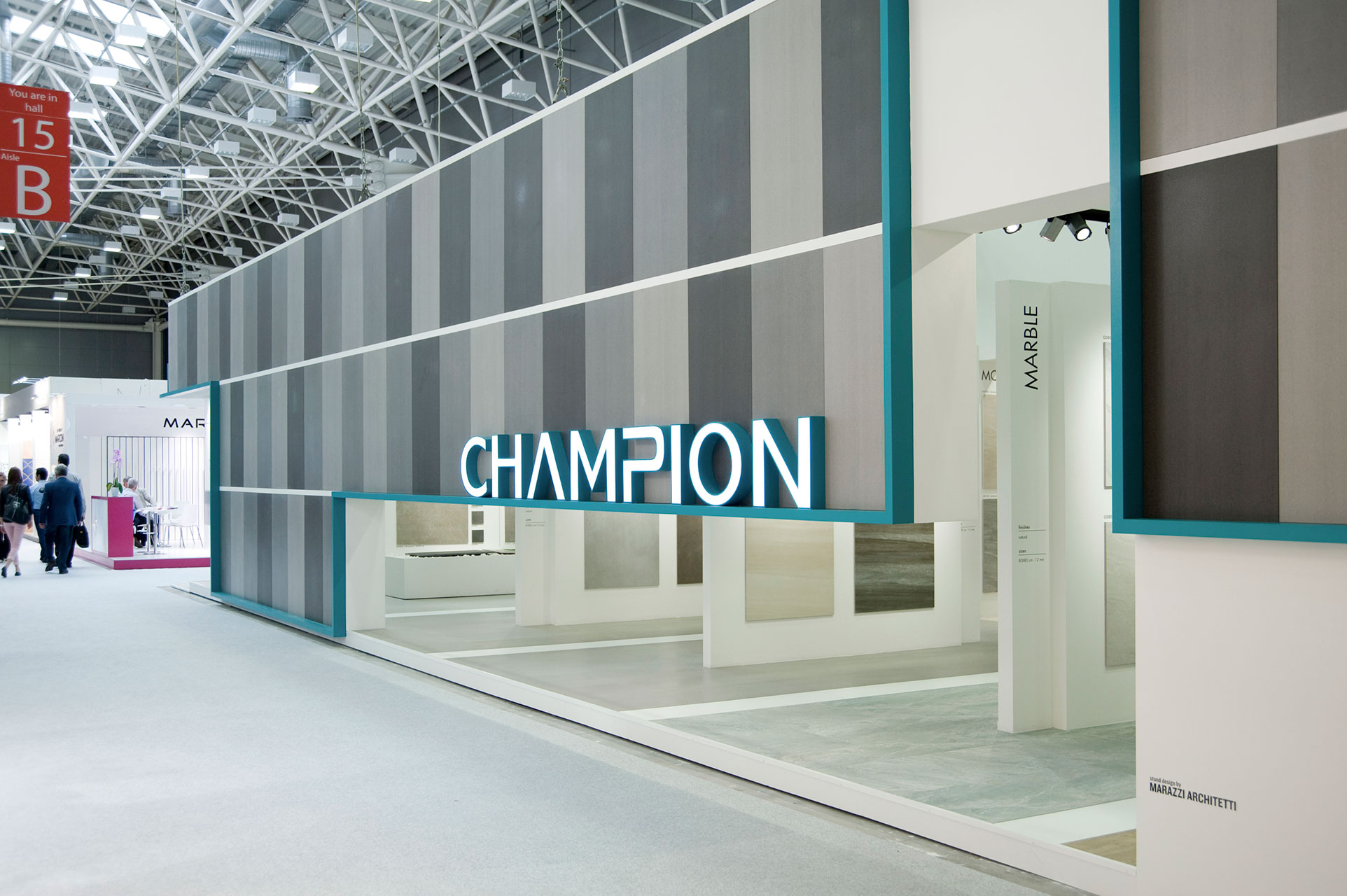
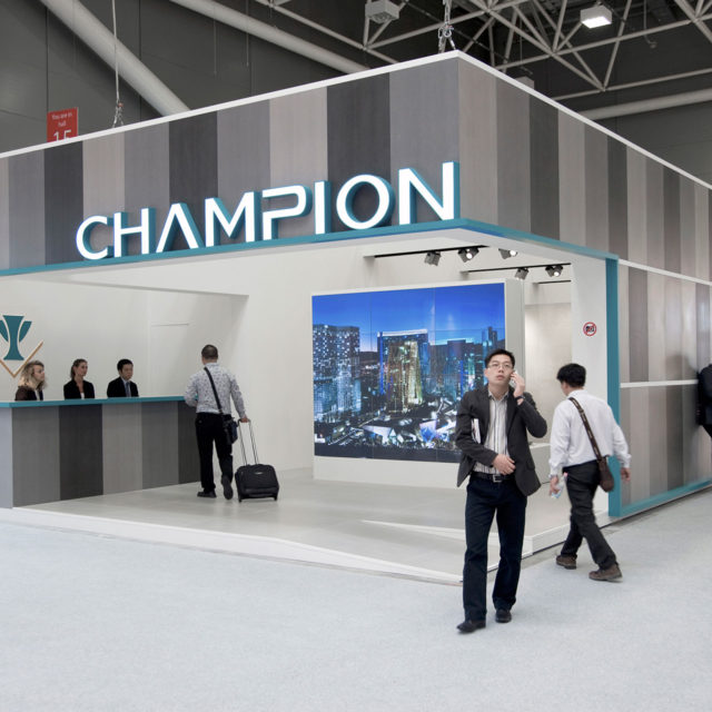
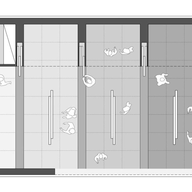
As such, the stand is treated as a small piece of architecture: a stereometric volume that has been “carved”, cut and dug out around its perimeter to arouse curiosity and create a sense of anticipation by partially revealing the exhibition and events taking place inside. Dynamic facades, covered with a pattern of random design made up of sheets measuring 60 x 120 cm in different shades of grey (with a basalt stone effect) give the stand a fresh and attractive appearance. The vertical arrangement of the tiles and the open joints are a direct reference to their application in ventilated facades, one of the company’s top products. A green aluminium profile that runs all around the pavilion serves not only to highlight the three-dimensional CHAMPION signs but also makes an elegant addition to the facades. The entrance, where the reception is placed, is characterised by the presence of a large video-wall that presents key information about the company; inside a rich sequence of panels and alcoves enables a wide range of the company’s products to be clearly displayed in various different formats, finishes and colours. At the end of the stand is a work area characterised by a surface with a highly-articulated design.
Photos

Drawings

CLIENT
CHAMPION Building Materials Co. LTD.
LOCATION
Cersaie - Bologna (Italy)
DIMENSIONS
Built area = 160 sqm
CONSTRUCTION BUDGET
100.000 euro
TIMELINE
2014